# paquetes ----------------------------------------------------------------
library(tidyverse)
library(glue)
library(ggtext)
library(showtext)
library(patchwork)
# fuente ------------------------------------------------------------------
# colores, RColorBrewer, Set1
c1 <- "#F781BF"
c2 <- "#FFD92F"
c3 <- "#B3E2CD"
c4 <- "#4DAF4A"
c5 <- "grey90"
# texto gral
font_add_google(name = "Ubuntu", family = "ubuntu")
# wage, eje vertical
font_add_google(name = "Victor Mono", family = "victor", db_cache = FALSE)
# años, eje horizontal
font_add_google(name = "Bebas Neue", family = "bebas", db_cache = FALSE)
# título
font_add_google(name = "Taviraj", family = "taviraj")
# íconos
font_add("fa-brands", "icon/Font Awesome 6 Brands-Regular-400.otf")
font_add("fa-solids", "icon/Font Awesome 6 Free-Solid-900.otf")
showtext_auto()
showtext_opts(dpi = 300)
# caption
fuente <- glue("Datos: <span style='color:{c3};'><span style='font-family:victor;'>{{<b>tidytuesdayR</b>}}</span> semana 36. Union Membership and Coverage Database. B. Hirsch, D. Macpherson, W. Even</span>")
autor <- glue("Autor: <span style='color:{c3};'>**Víctor Gauto**</span>")
icon_twitter <- glue("<span style='font-family:fa-brands;'></span>")
icon_github <- glue("<span style='font-family:fa-brands;'></span>")
usuario <- glue("<span style='color:{c3};'>**vhgauto**</span>")
sep <- glue("**|**")
mi_caption <- glue("{fuente}<br>{autor} {sep} {icon_github} {icon_twitter} {usuario}")
# datos -------------------------------------------------------------------
browseURL("https://github.com/rfordatascience/tidytuesday/blob/master/data/2023/2023-09-05/readme.md")
wages <- readr::read_csv('https://raw.githubusercontent.com/rfordatascience/tidytuesday/master/data/2023/2023-09-05/wages.csv')
# me interesa ver la diferencia entre el sueldo de varones y mujeres, y comparar
# grupos demográficos distintos
# traducción de los grupos demográficos
tipo_nivel_trad <- c(
white = "Personas blancas",
black = "Personas afroamericanas",
hispanic = "Personas hispanas")
d <- wages |>
filter(str_detect(facet, "demographics") & str_detect(facet, "male|female")) |>
select(year, facet, wage) |>
mutate(facet = str_remove(facet, "demographics: ")) |>
filter(facet != "male" & facet != "female") |>
separate_wider_delim(
cols = facet, delim = " ", names = c("tipo", "sex"),
too_few = "align_end") |>
mutate(tipo = tipo_nivel_trad[tipo]) |>
mutate(tipo = factor(tipo, levels = tipo_nivel_trad))
# personas blancas, referencia para todos los paneles
w <- wages |>
filter(str_detect(facet, "demographics") & str_detect(facet, "male|female")) |>
select(year, facet, wage) |>
mutate(facet = str_remove(facet, "demographics: ")) |>
filter(str_detect(facet, "white")) |>
separate_wider_delim(
cols = facet, delim = " ", names = c("tipo", "sex"),
too_few = "align_end") |>
select(-tipo)
# figura ------------------------------------------------------------------
# función que genera las figuras, por grupo demográfico
f_gg <- function(x) {
e <- d |>
filter(tipo == x)
g <- ggplot(e, aes(year, wage, color = sex)) +
# recuadros de cada panel
annotate(
geom = "segment",
x = c(1973, 2022, 2022, 1973),
xend = c(2022, 2022, 1973, 1973),
y = c(0, 0, 40, 40),
yend = c(0, 40, 40, 0),
color = "grey30",
lineend = "round",
linewidth = 1) +
# referencia
geom_line(data = w, linewidth = .5, linetype = 3) +
# sueldo
geom_line(
linewidth = 2, lineend = "round", show.legend = FALSE) +
# escalas
scale_x_continuous(expand = c(0, 0)) +
scale_y_continuous(
breaks = seq(0, 40, 10), limits = c(0, 40), expand = c(0, 0),
labels = scales::label_dollar()) +
scale_color_manual(values = c(c4, c1)) +
coord_cartesian(clip = "off") +
labs(x = NULL, y = "Dólares/hora, nominales (EEUU)", title = x) +
theme_minimal() +
theme(
aspect.ratio = 1,
legend.position = "none",
plot.margin = margin(13, 13, 13, 13),
plot.background = element_blank(),
plot.title = element_text(
color = "white", size = 25, family = "ubuntu", hjust = 1),
panel.background = element_blank(),
panel.grid.minor = element_blank(),
panel.grid.major = element_line(
color = "grey60", linewidth = .1, linetype = "8f"),
panel.spacing = unit(2, "line"),
axis.text.y = element_text(color = c5, family = "ubuntu", size = 15),
axis.text.x = element_text(color = c5, family = "bebas", size = 20),
axis.title.y = element_text(color = c5, family = "ubuntu", size = 20)
)
return(g)
}
# título y subtítulo
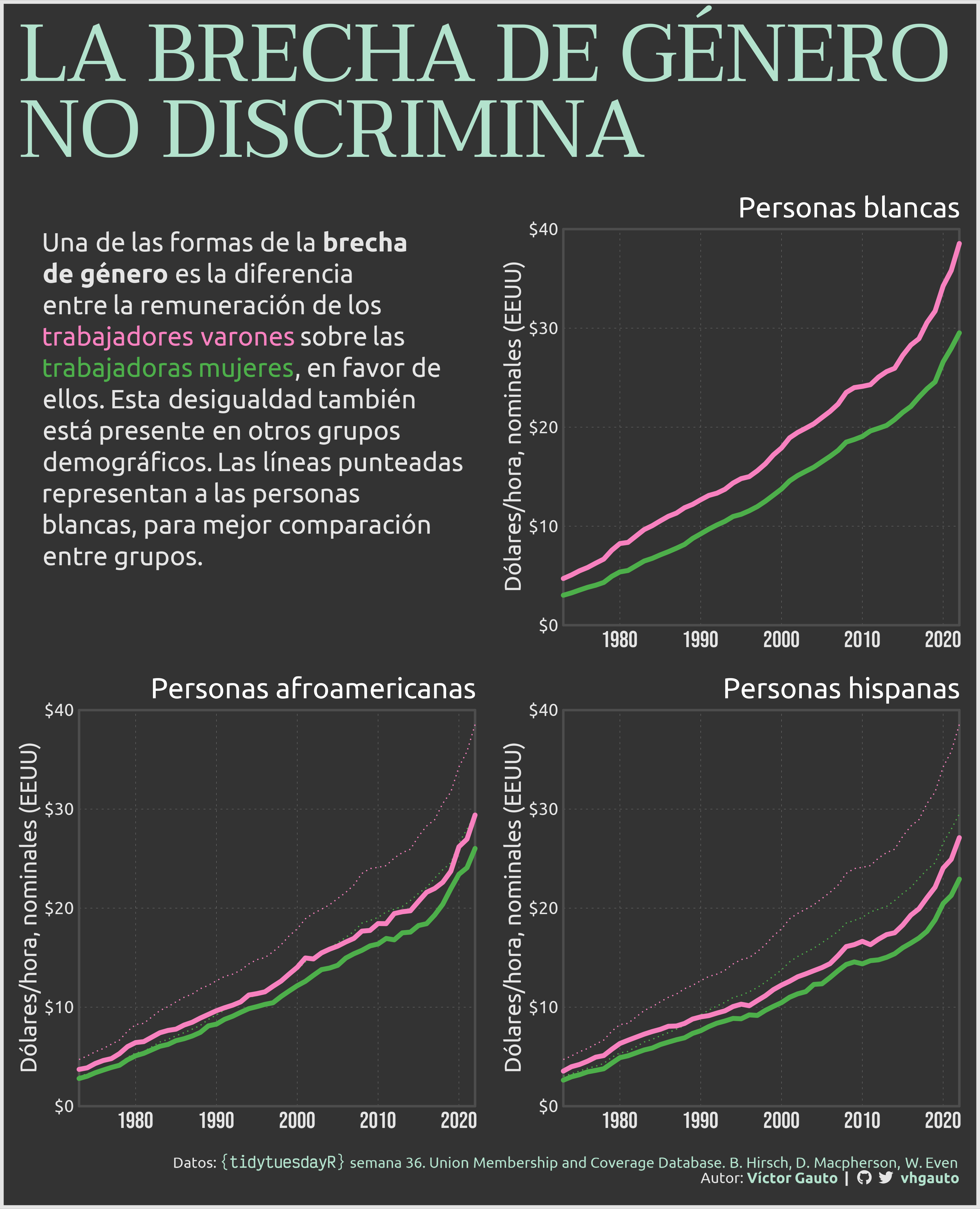
mi_title <- str_to_upper("La brecha de género<br>no discrimina")
mi_texto <- glue(
"Una de las formas de la **brecha de género** es la diferencia entre la
remuneración de los trabajadores varones sobre las trabajadoras mujeres, en
favor de ellos. Esta desigualdad también está presente en otros grupos
demográficos. Las líneas punteadas representan a las personas blancas, para
mejor comparación entre grupos.") |>
str_wrap(width = 34) |>
# cambio a '<br>' para usar ggtext::geom_richtext()
str_replace_all(pattern = "\n", replacement = "<br>") |>
str_replace(
pattern = "trabajadores varones",
replacement = glue("<span style='color:{c1}'>trabajadores varones</span>")) |>
str_replace(
pattern = "trabajadoras mujeres",
replacement = glue("<span style='color:{c4}'>trabajadoras mujeres</span>"))
# figura que contiene el subtítulo
g_texto <- ggplot(tibble(x = 0, y = 0), aes(x, y)) +
annotate(
geom = "richtext", family = "ubuntu", label.color = NA,
hjust = 0, vjust = 1, fill = NA,
label = mi_texto, x = -1, y = 0, size = 8, color = c5) +
geom_point(color = NA) +
coord_cartesian(xlim = c(0, 10), ylim = c(-10, 0), expand = FALSE, clip = "off") +
theme_void() +
theme(
aspect.ratio = 1,
)
# lista que contiene las figuras por grupo demográfico y el subtítulo
g_lista <- c(list(g_texto), map(unique(d$tipo), f_gg))
# diseño de posición de las figuras
arreglo <- "
AB
CD
"
# figura
g <- wrap_plots(g_lista, design = arreglo) +
plot_annotation(
caption = mi_caption,
title = mi_title,
theme = theme(
plot.margin = margin(21.2, 5, 15, 5),
plot.background = element_rect(
fill = "grey20", color = c5, linewidth = 3),
plot.title = element_markdown(
size = 70, color = c3, hjust = 0, family = "taviraj"),
plot.caption = element_markdown(
color = c5, family = "ubuntu", size = 13, margin = margin(10, 0, 5, 0)),
)
)
# guardo
ggsave(
plot = g,
filename = "2023/semana_36/viz.png",
width = 30,
height = 37,
units = "cm")
# abro
browseURL("2023/semana_36/viz.png")