Ocultar código
library(glue)
library(ggtext)
library(showtext)
library(tidyverse)Efecto de la eliminación de dos observaciones en las mediciones de plomo en agua, en la ciudad de Flint (EE.UU.)
library(glue)
library(ggtext)
library(showtext)
library(tidyverse)Colores.
c1 <- "#326812"
c2 <- "#C31E6E"
c3 <- "#7640A9"
c4 <- "grey96"
c5 <- "#EF5FAF"
c6 <- "#659A32"
c7 <- "#4C7D96"
Fuentes: Ubuntu y JetBrains Mono.
font_add(
  family = "ubuntu",
  regular = "././fuente/Ubuntu-Regular.ttf",
  bold = "././fuente/Ubuntu-Bold.ttf",
  italic = "././fuente/Ubuntu-Italic.ttf"
)

font_add(
  family = "jet",
  regular = "././fuente/JetBrainsMonoNLNerdFontMono-Regular.ttf"
)

showtext_auto()
showtext_opts(dpi = 300)fuente <- glue(
"Datos: <span style='color:{c1};'><span style='font-family:jet;'>",
"{{<b>tidytuesdayR</b>}}</span> semana 44, ",
"<b> Using Flint, Michigan, lead data in introductory statistics</b>",
" Loux y Gibson (2018)</span>."
)
autor <- glue("<span style='color:{c1};'>**Víctor Gauto**</span>")
icon_twitter <- glue("<span style='font-family:jet;'></span>")
icon_instagram <- glue("<span style='font-family:jet;'></span>")
icon_github <- glue("<span style='font-family:jet;'></span>")
icon_mastodon <- glue("<span style='font-family:jet;'>󰫑</span>")
icon_bsky <- glue("<span style='font-family:jet;'></span>")
usuario <- glue("<span style='color:{c1};'>**vhgauto**</span>")
sep <- glue("**|**")
mi_caption <- glue(
"{fuente}<br>{autor} {sep} {icon_github} {icon_twitter} {icon_instagram} ",
"{icon_mastodon} {icon_bsky} {usuario}"
)tuesdata <- tidytuesdayR::tt_load(2025, 44)
flint_mdeq <- tuesdata$flint_mdeq
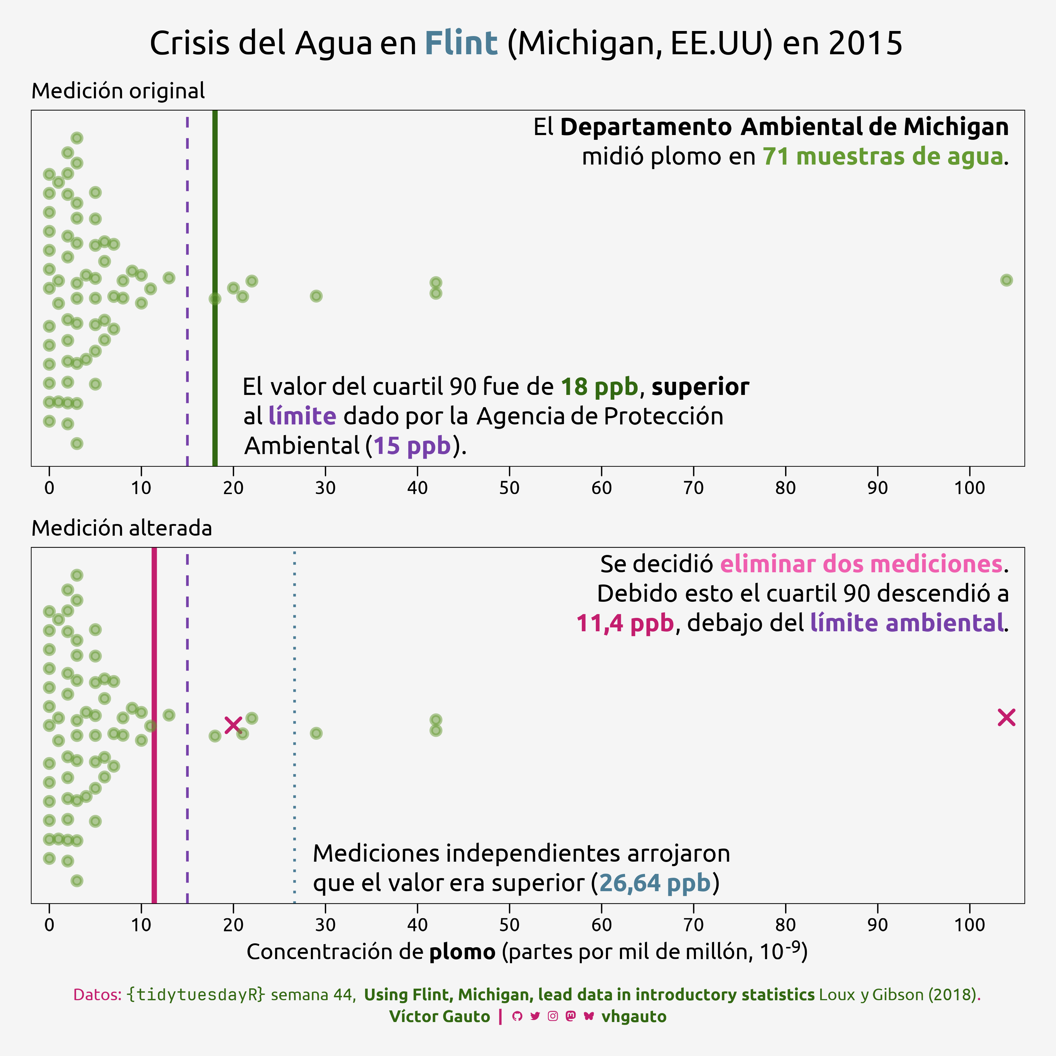
flint_vt <- tuesdata$flint_vtMe interesa ver cómo se modificaron los límite debido la eliminación de dos valores. Creo dos paneles, el superior con todas las mediciones; y el inferior, con los datos modificados que reducen el valor límite.
Calculo los cuartiles 90 de las mediciones de plomo.
l1 <- quantile(flint_mdeq$lead, probs = .9, na.rm = TRUE)
l2 <- quantile(flint_mdeq$lead2, probs = .9, na.rm = TRUE)
l3 <- quantile(flint_vt$lead, probs = .9, na.rm = TRUE)
Función para dar formato a los valores y el límite ambiental.
formato <- \(q) {
  format(q, decimal.mark = ",", big.mark = ".")
}

lim <- 15
Acomodo los datos e indico si las mediciones son las originales o modificadas.
d <- select(flint_mdeq, -notes, -sample) |>
  pivot_longer(
    cols = contains("lead"),
    values_to = "valor",
    names_to = "medición"
  ) |>
  mutate(eliminado = if_else(is.na(valor), TRUE, FALSE)) |>
  fill(valor) |>
  mutate(
    medición = factor(
      medición,
      levels = c("lead", "lead2"),
      labels = c("Medición original", "Medición alterada")
    )
)Anotaciones a los paneles, tamaño de texto y título de la figura.
text_tamaño <- 7

text1 <- glue(
  "El **Departamento Ambiental de Michigan**<br>midió plomo en ",
  "<b style='color: {c6};'>{nrow(flint_mdeq)} muestras de agua</b>."
)

text2 <- glue(
  "El valor del cuartil 90 fue de ",
  "<b style='color: {c1};'>{l1} ppb</b>, **superior**<br>al ",
  "<b style='color: {c3};'>límite</b> dado por la Agencia de Protección<br>",
  "Ambiental (<b style='color: {c3};'>{lim} ppb</b>)."
)

text3 <- glue(
  "Se decidió <b style='color: {c5};'>eliminar dos mediciones</b>.<br>",
  "Debido esto el cuartil 90 descendió a<br>",
  "<b style='color: {c2};'>{formato(l2)} ppb</b>, ",
  "debajo del <b style='color: {c3};'>límite ambiental</b>."
)

text4 <- glue(
  "Mediciones independientes arrojaron<br>que el valor era ",
  "superior (<b style='color: {c7};'>{formato(l3)} ppb</b>)"
)

mi_titulo <- glue(
  "Crisis del Agua en <b style='color: {c7};'>Flint</b> ",
  "(Michigan, EE.UU) en 2015"
)
Figura.
g <- ggplot(
  d,
  aes(valor, y = "1", color = eliminado, shape = eliminado, alpha = eliminado)
) +
  geom_vline(xintercept = l1, layout = 1, color = c1, linewidth = 2) +
  geom_vline(xintercept = l2, layout = 2, color = c2, linewidth = 2) +
  geom_vline(
    xintercept = l3,
    layout = 2,
    color = c7,
    linewidth = 1,
    linetype = 3
  ) +
  geom_vline(xintercept = lim, linetype = 2, color = c3, linewidth = 1) +
  ggbeeswarm::geom_quasirandom(cex = 4, width = .6, stroke = 2) +
  annotate(
    geom = "richtext",
    x = I(c(.99, .21)),
    y = I(c(.99, .01)),
    label = c(text1, text2),
    family = "ubuntu",
    size = text_tamaño,
    fill = NA,
    label.color = NA,
    layout = 1,
    hjust = c(1, 0),
    vjust = c(1, 0)
  ) +
  annotate(
    geom = "richtext",
    x = I(c(.99, .28)),
    y = I(c(.99, .01)),
    label = c(text3, text4),
    family = "ubuntu",
    size = text_tamaño,
    fill = NA,
    label.color = NA,
    layout = 2,
    hjust = c(1, 0),
    vjust = c(1, 0)
  ) +
  facet_wrap(vars(medición), ncol = 1, axes = "all_x") +
  scale_x_continuous(
    breaks = scales::breaks_width(10),
    expand = expansion(mult = 0, add = 2)
  ) +
  scale_color_manual(
    breaks = c(TRUE, FALSE),
    values = c(c2, c6)
  ) +
  scale_shape_manual(values = c(20, 4)) +
  scale_alpha_manual(values = c(.5, 1)) +
  labs(
    title = mi_titulo,
    x = "Concentración de **plomo** (partes por mil de millón, 10<sup>-9</sup>)",
    caption = mi_caption
  ) +
  ggthemes::theme_par(base_family = "ubuntu", base_size = 15) +
  theme_sub_legend(position = "none") +
  theme_sub_plot(
    background = element_rect(fill = c4),
    title = element_markdown(size = rel(1.8), face = "plain"),
    margin = margin_auto(25),
    caption = element_markdown(
      color = c2,
      hjust = .5,
      size = rel(.9),
      margin = margin(t = 20),
      lineheight = 1.3
    )
  ) +
  theme_sub_axis_y(
    text = element_blank(),
    ticks = element_blank(),
    title = element_blank()
  ) +
  theme_sub_axis_x(title = element_markdown(size = rel(1.2))) +
  theme_sub_strip(
    background = element_blank(),
    text = element_text(hjust = 0, size = rel(1.2))
  )
Guardo.
ggsave(
  plot = g,
  filename = "tidytuesday/2025/semana_44.png",
  width = 30,
  height = 30,
  units = "cm"
)