# paquetes ----------------------------------------------------------------
library(glue)
library(ggtext)
library(showtext)
library(tidyverse)
# fuente ------------------------------------------------------------------
MetBrewer::met.brewer(name = "VanGogh2")
MetBrewer::met.brewer(name = "Benedictus")
# colores
c1 <- "#F9E0E8"
c2 <- "#D8527C"
c3 <- "#9A133D"
c4 <- "#BD3107"
c5 <- "#D9700F"
c6 <- "#454B87"
c7 <- "#89A6BB"
c8 <- "#F9B4C9"
# texto gral
font_add_google(name = "Ubuntu", family = "ubuntu")
# horas, días
font_add_google(name = "Victor Mono", family = "victor", db_cache = FALSE)
# íconos
font_add("fa-brands", "icon/Font Awesome 6 Brands-Regular-400.otf")
showtext_auto()
showtext_opts(dpi = 300)
# caption
fuente <- glue(
"Datos: <span style='color:{c3};'><span style='font-family:mono;'>",
"{{<b>tidytuesdayR</b>}}</span> semana 2. ",
"Statistics Canada & NHL API.</span>")
autor <- glue("<span style='color:{c3};'>**Víctor Gauto**</span>")
icon_twitter <- glue("<span style='font-family:fa-brands;'></span>")
icon_github <- glue("<span style='font-family:fa-brands;'></span>")
icon_mastodon <- glue("<span style='font-family:fa-brands;'></span>")
usuario <- glue("<span style='color:{c3};'>**vhgauto**</span>")
sep <- glue("**|**")
mi_caption <- glue(
"{fuente}<br>{autor} {sep} {icon_github} {icon_twitter} {icon_mastodon}
{usuario}")
# datos -------------------------------------------------------------------
browseURL("https://github.com/rfordatascience/tidytuesday/blob/master/data/2024/2024-01-09/readme.md")
tuesdata <- tidytuesdayR::tt_load(2024, week = 2)
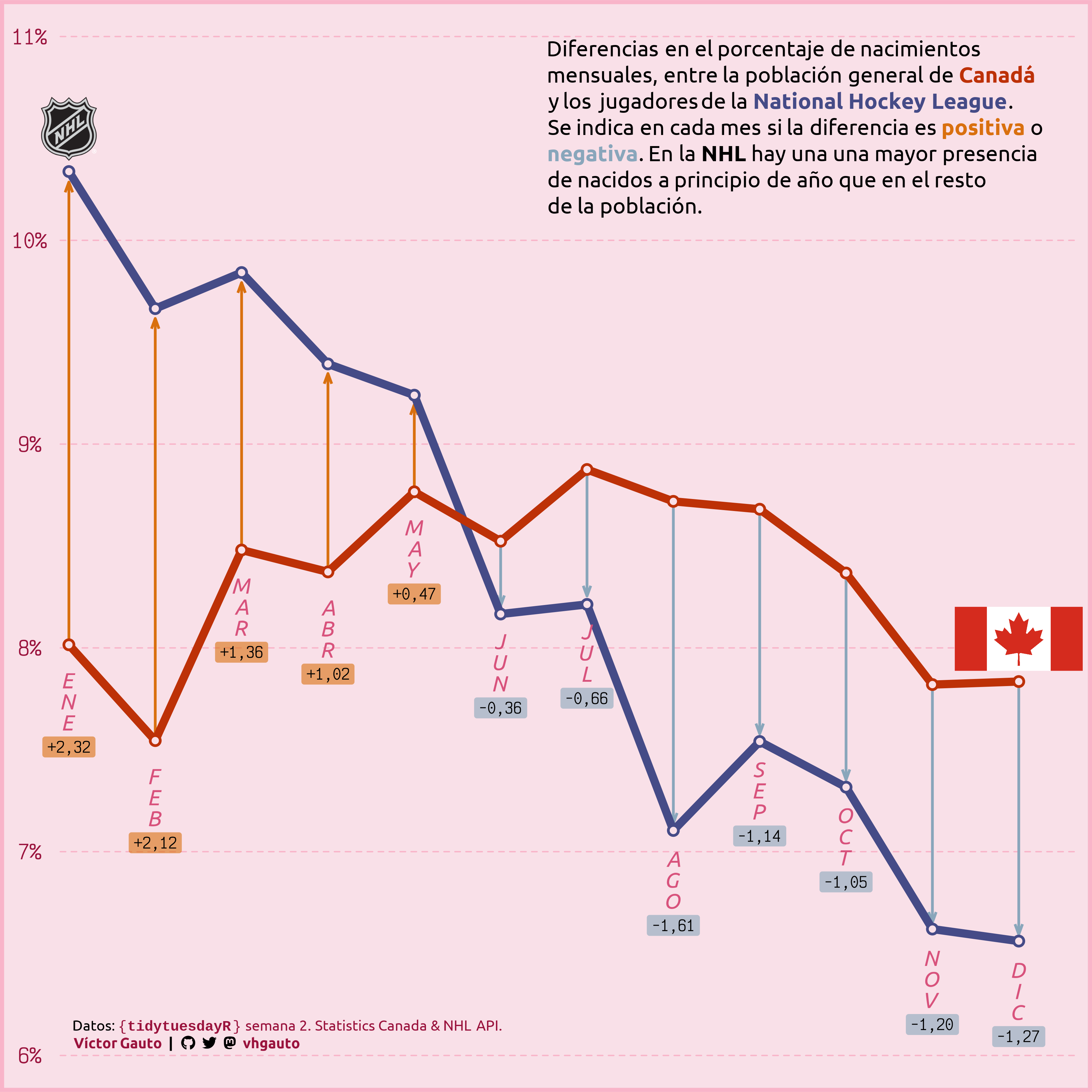
# me interesa las diferencias entre el porcentaje de nacimientos por mes, entre
# la población general de Canadá y los integrantes de la NHL
canada <- tuesdata$canada_births_1991_2022
nhl <- tuesdata$nhl_player_births
# etiquetas de los meses
meses <- ymd(glue("2020-{1:12}-01")) |>
format("%b") |>
str_to_upper() |>
str_remove(pattern = "\.")
names(meses) <- 1:12
# datos de Canadá
d_canada <- canada |>
reframe(
suma_mes = sum(births),
.by = month) |>
mutate(porcent = suma_mes/sum(suma_mes)*100) |>
select(mes = month, porcent) |>
mutate(tipo = "Canadá")
d_nhl <- nhl |>
count(birth_month) |>
mutate(porcent = n/sum(n)*100) |>
select(mes = birth_month, porcent) |>
mutate(tipo = "NHL")
# porcentajes de nacimientos por mes, de la población de Canadá y NHL
d <- bind_rows(d_canada, d_nhl) |>
mutate(color = if_else(tipo == "Canadá", c4, c6))
# tabla ancha, para agregar etiquetas de cambio de porcentajes y flechas
d2 <- d |>
select(-color) |>
pivot_wider(names_from = tipo, values_from = porcent) |>
mutate(dif = NHL - Canadá) |>
mutate(y_medio = Canadá + dif/2) |>
mutate(label = format(dif, digits = 2)) |>
mutate(label = str_replace(label, "\.", ",")) |>
mutate(label = str_replace(label, " ", "+")) |>
mutate(color = if_else(dif > 0, c5, c7)) |>
mutate(NHL = ifelse(dif > 0, NHL*.995, NHL*1.005)) |>
mutate(y_mes = if_else(Canadá < NHL, Canadá, NHL)) |>
mutate(label_mes = meses[mes]) |>
mutate(label_mes = str_split(label_mes, "")) |>
mutate(label_mes = map(label_mes, ~ str_flatten(.x, collapse = "n"))) |>
unnest(label_mes)
# figura ------------------------------------------------------------------
mi_subtitle <- glue(
"Diferencias en el porcentaje de nacimientos<br>",
"mensuales, entre la población general de <b style='color:{c4}'>Canadá</b><br>",
"y los jugadores de la <b style='color:{c6}'>National Hockey League</b>.<br>",
"Se indica en cada mes si la diferencia es <b style='color:{c5}'>positiva</b> o<br>",
"<b style='color:{c7}'>negativa</b>. En la **NHL** hay una una mayor presencia<br>",
"de nacidos a principio de año que en el resto<br>",
"de la población."
)
i_canada <- "2024/s01/i_canada.png"
i_nhl <- "2024/s01/i_nhl.png"
i_y1 <- d[d$mes == 1 & d$tipo == "NHL",]$porcent
i_y2 <- d[d$mes == 12 & d$tipo == "Canadá",]$porcent
i_tbl <- tibble(img = c(i_nhl, i_canada)) |>
mutate(label = glue("<img src={img} height='50'>")) |>
mutate(x = c(1, 12), y = c(i_y1, i_y2))
g <- ggplot(d, aes(mes, porcent)) +
# flechas
geom_segment(
data = d2,
aes(x = mes, xend = mes, y = Canadá, yend = NHL, color = color),
arrow = arrow(angle = 20, length = unit(3, "mm"), type = "open"),
linewidth = 1) +
# líneas
geom_line(aes(color = color), linewidth = 3) +
# puntos
geom_point(aes(color = color), size = 4) +
geom_point(color = c1, size = 2) +
# porcentaje de cambio
geom_label(
data = d2, aes(
mes, y_mes, label = label, fill = alpha(color, .6)), hjust = .5,
nudge_x = 0, nudge_y = -.45, family = "victor", size = 4, color = "black",
label.size = unit(0, "mm"), vjust = 1) +
# meses
geom_text(
data = d2, aes(mes, y_mes, label = label_mes), family = "ubuntu",
color = c2, nudge_y = -.28, fontface = "italic", size = 6,
lineheight = unit(.8, "line")) +
# imágenes de NHL & Canadá
geom_richtext(
data = i_tbl, aes(x, y, label = label), fill = NA, label.color = NA,
vjust = 0, nudge_y = .03) +
# subtítulo
annotate(
geom = "richtext", x = 6.5, y = 11, label = mi_subtitle, hjust = 0, vjust = 1,
color = "black", fill = NA, label.color = NA, family = "ubuntu", size = 6) +
# epígrafe
annotate(
geom = "richtext", x = 1, y = 6, label = mi_caption, hjust = 0, vjust = 0,
color = "black", fill = NA, label.color = NA, family = "ubuntu", size = 4) +
scale_x_continuous(breaks = 1:12, labels = meses, limits = c(.9, 12.7)) +
scale_y_continuous(
limits = c(6, 11), breaks = 6:11,
labels = scales::label_number(suffix = "%")) +
scale_color_identity() +
scale_fill_identity() +
coord_cartesian(clip = "off", expand = FALSE) +
theme_void() +
theme(
aspect.ratio = 1,
plot.margin = margin(28.5, 10, 28.5, 10),
plot.background = element_rect(fill = c1, color = c8, linewidth = 3),
plot.subtitle = element_markdown(family = "ubuntu"),
plot.caption = element_markdown(family = "ubuntu"),
panel.background = element_blank(),
panel.grid.minor = element_blank(),
panel.grid.major.y = element_line(
linetype = 2, linewidth = .5, color = c8),
axis.text.y = element_text(
family = "victor", size = 15, margin = margin(r = 10), color = c3)
)
# guardo
ggsave(
plot = g,
filename = "2024/s02/viz.png",
width = 30,
height = 30,
units = "cm")
# abro
browseURL("2024/s02/viz.png")