Ocultar código
library(glue)
library(ggtext)
library(showtext)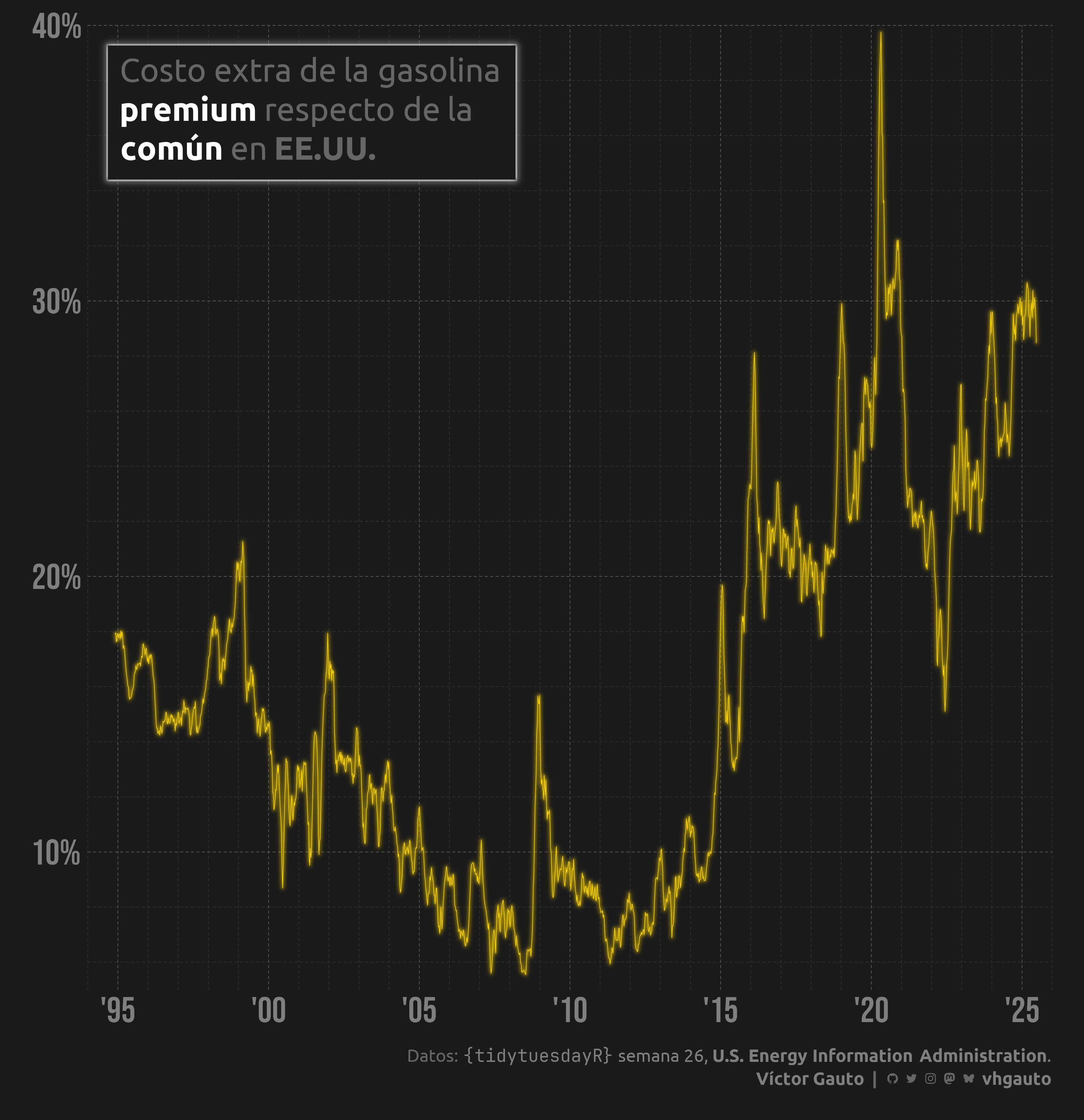
library(tidyverse)Relación entre la gasolina regular respecto de la premium.
library(glue)
library(ggtext)
library(showtext)
library(tidyverse)Colores.
c1 <- "gold"
c2 <- "grey50"
c3 <- "grey40"
c4 <- "grey20"
c5 <- "grey10"
c6 <- "white"
Fuentes: Ubuntu y JetBrains Mono.
font_add(
  family = "ubuntu",
  regular = "././fuente/Ubuntu-Regular.ttf",
  bold = "././fuente/Ubuntu-Bold.ttf",
  italic = "././fuente/Ubuntu-Italic.ttf"
)

font_add(
  family = "jet",
  regular = "././fuente/JetBrainsMonoNLNerdFontMono-Regular.ttf"
)

font_add(
  family = "bebas neue",
  regular = "././fuente/BebasNeue-Regular.ttf"
)

showtext_auto()
showtext_opts(dpi = 300)fuente <- glue(
"Datos: <span style='color:{c2};'><span style='font-family:jet;'>",
"{{<b>tidytuesdayR</b>}}</span> semana 26, ",
"<b>U.S. Energy Information Administration</b>.</span>"
)
autor <- glue("<span style='color:{c2};'>**Víctor Gauto**</span>")
icon_twitter <- glue("<span style='font-family:jet;'></span>")
icon_instagram <- glue("<span style='font-family:jet;'></span>")
icon_github <- glue("<span style='font-family:jet;'></span>")
icon_mastodon <- glue("<span style='font-family:jet;'>󰫑</span>")
icon_bsky <- glue("<span style='font-family:jet;'></span>")
usuario <- glue("<span style='color:{c2};'>**vhgauto**</span>")
sep <- glue("**|**")
mi_caption <- glue(
"{fuente}<br>{autor} {sep} {icon_github} {icon_twitter} {icon_instagram} ",
"{icon_mastodon} {icon_bsky} {usuario}"
)tuesdata <- tidytuesdayR::tt_load(2025, 26)
gas_prices <- tuesdata$weekly_gas_pricesMe interesa la evolución de la relación entre el precio de la gasolina común respecto de la premium.
d <- gas_prices |>
  filter(
    fuel == "gasoline",
    grade %in% c("regular", "premium"),
    formulation == "all"
  ) |>
  select(-fuel, -formulation) |>
  pivot_wider(
    names_from = grade,
    values_from = price,
    id_cols = date
  ) |>
  drop_na() |>
mutate(r = (premium-regular)/regular)El paquete {ggfx} sirve para generar el brillo de la caja de texto y la línea de evolución.
Creo dos títulos: mi_titulo1 para generar el espacio y darle brillo al contorno, y mi_titulo2 para mostrar el texto, quitando el contorno.
mi_titulo1 <- glue(
  "Costo extra de la gasolina<br><b style='color: white'>premium</b> respecto
  de la<br><b style='color: white'>común</b> en **EE.UU.**"
)

mi_titulo2 <- glue(
  "Costo extra de la gasolina<br>premium respecto
  de la<br>común en **EE.UU.**"
)
Figura.
g <- ggplot(d, aes(date, r)) +
  ggfx::with_blur(
    geom_line(color = c1, lineend = "round", linewidth = 1, alpha = 1),
    sigma = 14
  ) +
  geom_line(color = c1, lineend = "round", linewidth = .5, alpha = 1) +
  ggfx::with_blur(
    geom_richtext(
      x = I(.02), y = I(.98), label = mi_titulo2, hjust = 0, vjust = 1,
      color = NA, family = "ubuntu", size = 9, label.r = unit(0, "mm"),
      label.padding = unit(4, "mm"), fill = c5, label.color = c6,
      label.size = unit(.6, "mm")
    ),
    sigma = 10,
    stack = TRUE
  ) +
  annotate(
    geom = "richtext",
    x = I(.02),
    y = I(.98),
    label = mi_titulo1,
    hjust = 0,
    vjust = 1,
    family = "ubuntu",
    fill = NA,
    color = c3,
    label.color = NA,
    label.r = unit(0, "mm"),
    label.padding = unit(4, "mm"),
    size = 9
  ) +
  scale_x_date(
    date_labels = "'%y",
    breaks = seq.Date(ymd(19900101), ymd(20270101), "5 year"),
    minor_breaks = "1 year",
    limits = c(ymd(19940101), ymd(20260101)),
    expand = c(0, 0)
  ) +
  scale_y_continuous(
    labels = scales::label_percent(),
    breaks = scales::breaks_width(.1),
    minor_breaks = scales::breaks_width(.02),
    limits = c(.05, .4),
    expand = c(0, 0)
  ) +
  coord_cartesian(clip = "off") +
  labs(x = NULL, y = NULL, caption = mi_caption) +
  theme_void(base_size = 20, base_family = "bebas neue") +
  theme(
    aspect.ratio = 1,
    plot.margin = margin(20, 20, 20, 20),
    plot.background = element_rect(fill = c5, color = NA),
    plot.caption = element_markdown(
      family = "ubuntu", color = c3, size = rel(.7), lineheight = 1.3,
      margin = margin(b = 5, t = 20)
    ),
    panel.background = element_blank(),
    panel.grid.major = element_line(
      linetype = "55", linewidth = .2, color = c3
    ),
    panel.grid.minor = element_line(
      linetype = "55", linewidth = .2, color = c4
    ),
    axis.text = element_text(size = rel(1.4), color = c2),
    axis.text.x = element_text(margin = margin(t = 5)),
    axis.text.y = element_text(margin = margin(r = 5))
  )
Guardo.
ggsave(
  plot = g,
  filename = "tidytuesday/2025/semana_26.png",
  width = 30,
  height = 31,
  units = "cm"
)